AWARDS
Big M, first place
Product Label - "Brushstrokes"
New label design for a Pacific NW winery.
This winery values quality, accessibility, and representing the NW wine culture. To demonstrate the uniqueness of each of their wines, Northwest Cellars wanted labels that were easy to identify, different, and simply descriptive of what was in each bottle.
These labels are a study in the juxtaposition of bold vs subtle: the big, bright monogram instantly identifies the varietal while establishing unity across the series, and the intricacies of the hand painted design gently describe the wine with changes in texture (rough, smooth, dry) and color (differing tones denoting the range of fruit flavors on the palate). NW Cellars now has a unique, unified label series that is appealing to both the new and discerning wine buyer.
Visit the Northwest Cellars tasting room in Kirkland, to pick up your very own bottles or inquire about shipping!


Finalist
Packaging Design - "Love Letter to Washington" Wine Label
Silver M
Product Label - "Love Letter to Washington" Wine Label
Inspired by classic travel posters, this label invites you to travel to the wonderful world of the Emerald State.
This label was created for a line of wines from across the state, for consumers across the state (and out). It incorporates iconic elements from Spokane to Seattle. Unlike anything else on the shelves, it stands out with bright Washington colors, clean graphics, and original style (and amazing wine!). This is a love letter to Washington, celebrating the diversity of people and landscape from east to west. Something to intrigue the consumer, and keep them coming back again and again, exciting loyalty and sharing their love of the Pacific NW.

Bronze M
Illustration - "The Emerald State"
Inspired by classic travel posters, this illustration invites you to travel to the wonderful world of the Emerald State.
This illustration was borne of a desire to fully represent and celebrate life across all of Washington State, from Spokane to Seattle, honoring its diversity of culture, landscape, and lifestyle. With a friendly illustrative and easy accessible style, it brings together everything that makes the Pacific NW unique and home to many hearts, the world around. A visual love letter to the Emerald State, dedicated to all that makes us unique, together.

Bronze M
Product Label - "Pairings" Wine Label
New wine label design for a quick and easy identification of the age old question, "What should I pair with this?"

Silver M
Trade Show Exhibit - Tieton Tent
A technical rendering for an illustrative concept - step into the world or Yakima Valley, to the land of apples.

Silver M
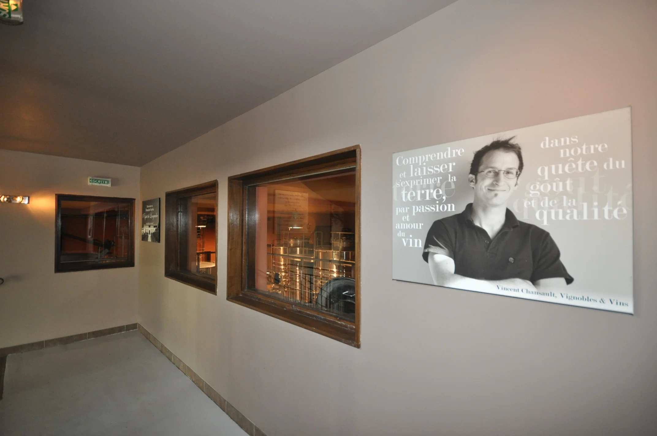
Collateral - "Domaine Gallery"
Canvas design for a winery's gallery in the Languedoc-Roussillon, France.
This organic vineyard, winery, wineschool, and restaurant is located in the heart of the Languedoc region in France, 30 minutes outside of Carcassonne. They are known for their award-winning wines, exquisite modern French cuisine sourcing local and seasonal ingredients, and stunning venue location.
To introduce the team to visitors, we envisioned populating the gallery in the winery, above the tasting room, with a photo of each member and their adage. The first two of the team photos were taken by me, the others by Ollie Ford and Joanne Payan. I added in the sayings for each in an illustrative fashion, had them printed, and then hung in the domaine's chic, modern style.
It was such a success that we continue to add to the gallery. Guests comment on the beautiful canvasses and how lovely it is to see the team and get a glimpse of each personality.


Bronze M
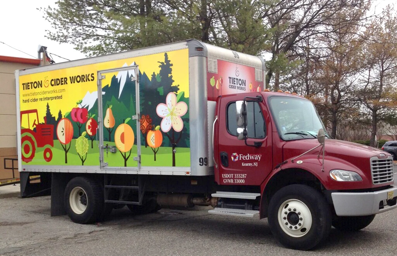
Semi truck design for a Pacific NW Cidery.
Tieton Cider Works is an enviable anomaly in the cider industry - family owned for three generations, all their heirloom cider apples are estate grown. As Washington's largest craft cider grower and producer, they are poised to become a category leader across the US.
While appealing to this large audience, Tieton Cider Works wanted to emphasize the importance of the estate grown concept while having fun with a recognizable truck for deliveries around cities. Designing the entire outside of the truck, I used the fruit trees from the already designed labels and took them out of that environment and into where they belong - the orchard. This is balanced with an aerial photo of the orchard (which is the inspiration behind their spiral logo) to show a brand that is rooted in good grounding and also just fun to drink.
The design was so well received that additional trucks have been commissioned.